Use the Beast Core 6 Details Pane plugin to gather additional information while inspecting a Component.
Select a Component to Research
Select a specific component in another Beast Core plugin prior to accessing the Details Pane.
Refer to these articles for additional information:
NOTE
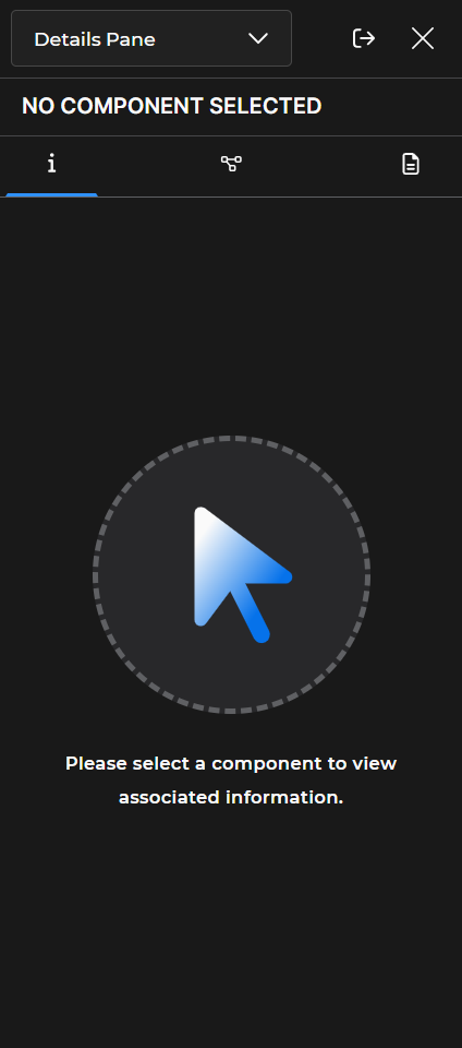
If you access the Details Pane without selecting a component:
NO COMPONENT SELECTED - Displays above the tab icons
Please select a component to view associated information. - Displays below the arrow graphic
Open the Details Pane
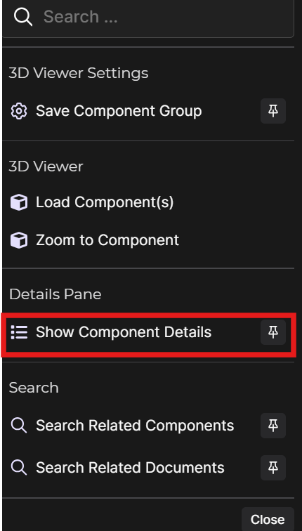
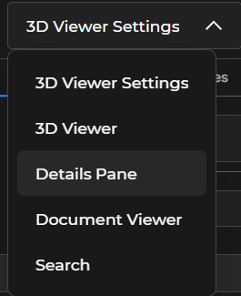
Beast Core provides multiple ways to access the Details Pane, including:
Selecting Show Component Details on another plugin’s pop-up Action Menu
Selecting Details Pane on the drop-down menu at the top of the left-hand content pane
Open Details Pane on Main Screen
Ensure you have a component selected in another plugin.
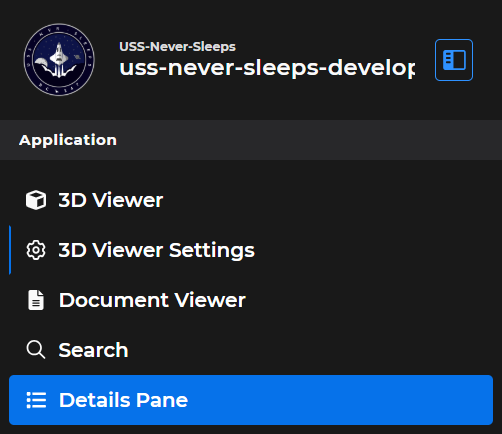
Use any of these options:
Click the far-left outline
 icon
iconSelect Details Pane in the left-hand navigations pane’s Application section
Or, if the Details Pane is currently open in the left-hand content pane, click the Swap
 button at the top of the pane
.png)
Explore Details Pane Tabs
Use the tab icons at the top of the Details Pane to select the type of component information you want to view.
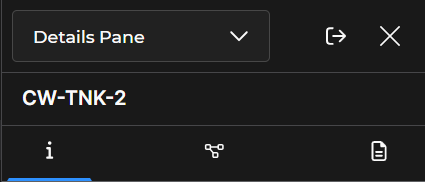
Information tab
 icon (default)
 Displays the selected component’s name and associated metadata
Connections tab
 icon
iconIdentifies other components with direct connections to your selected component
Documents tab
 icon
iconLists available documents associated with your selected component
.gif)