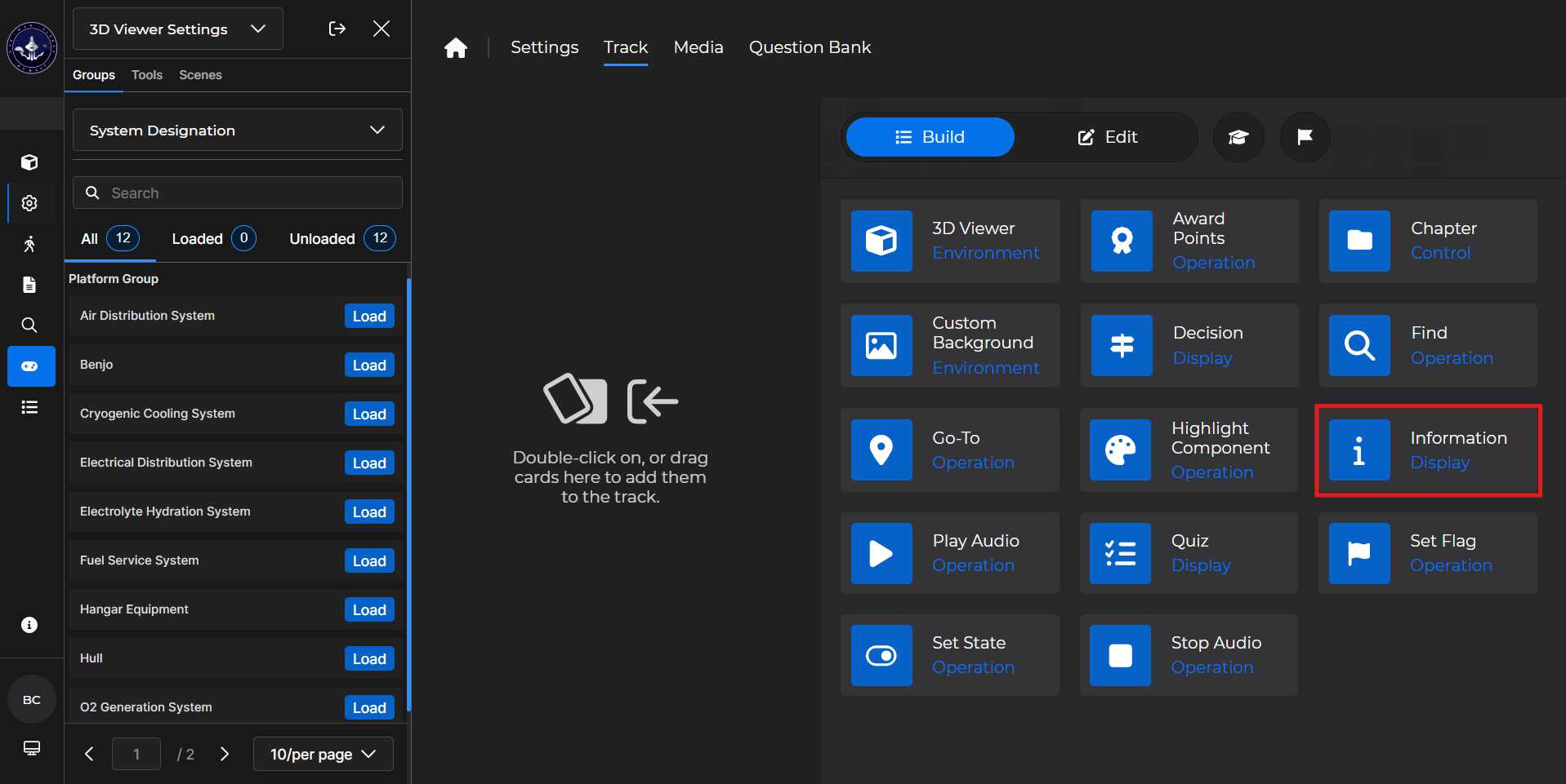
Use an Information card to display an overlay with information, optionally customized with HTML and/or CSS, about a desired topic.
Building the Card
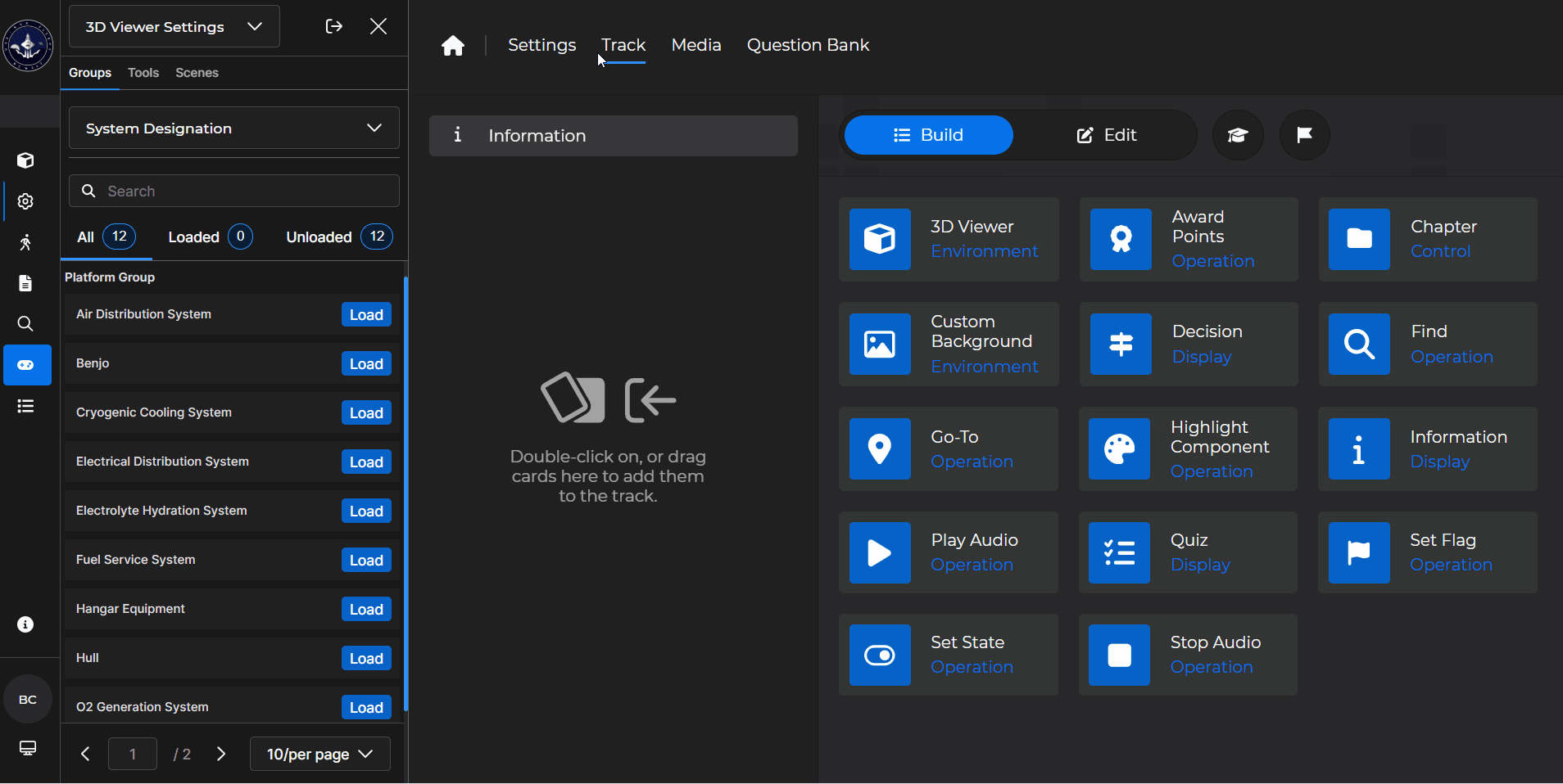
To add the card to the lesson track:
Left click and drag the card to the track
OR double click the card to add automatically
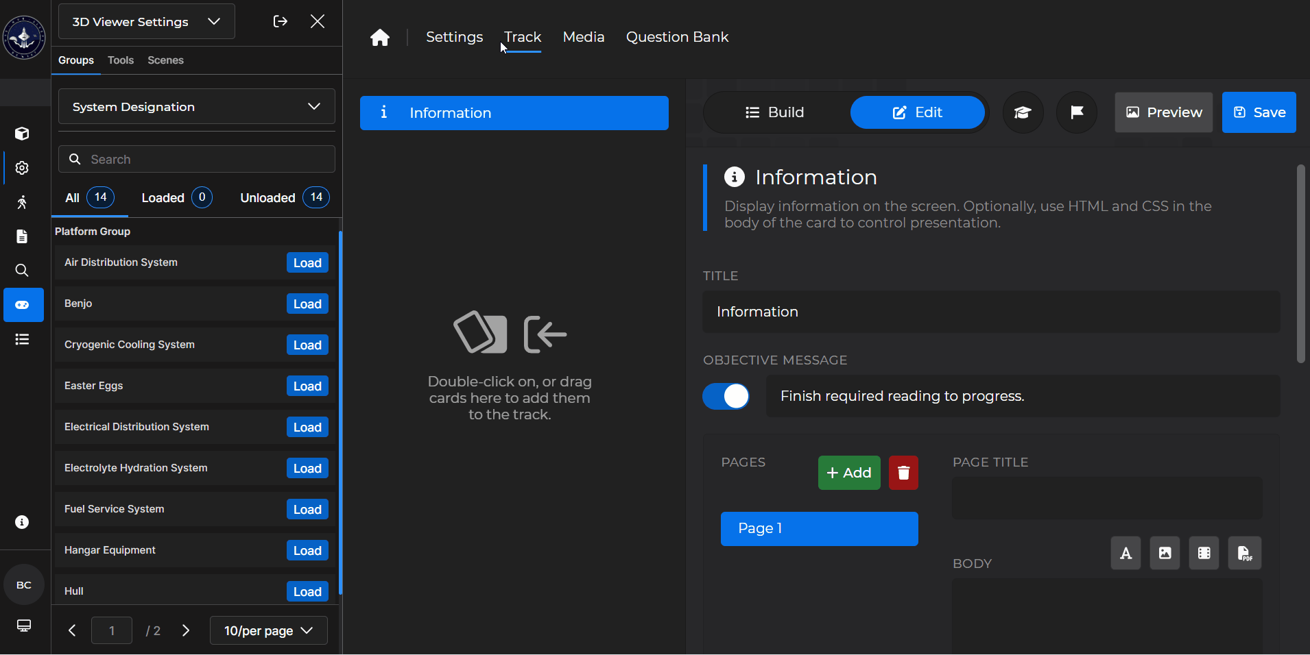
To begin editing:
Left click the card on the track and then left click

OR double left click the card on the track to open editing automatically
In the editing window, you can:
Change the title of the card
Toggle and/or edit an Objective Message
Add or delete pages on the Information card
You must have at least one page on the card
Add and edit the page title and body
Add a glossary term and/or media
.png) - Select this icon to add a definition to the card
- Select this icon to add a definition to the card - Select this icon to add pictures to the card
 - Select this icon to add videos to the card
 - Select this icon to add PDFs to the card
Add audio to the card
Edit component highlight information
Show or hide the table of contents
Information Card - Use Case
One popular use of an Information card is to allow a learner to get more information about a desired component.
Example: Follow the steps below to set up an Information Card where a learner can find out more details about a specific component:
Add a 3D Viewer card first.
Make sure the system contains the desired component
Add an Information Card beneath it.
Title it something recognizable
Then title the page something relevant
In the ‘Body’ of the card, enter relevant information and add desired definition(s) and/or media
Choose a desired highlight color
Search for the desired component you want the learner to get more details on
Select
 .
.Optionally
 the card.
.gif)